How do you redesign a brand that can be recognized by little more than a white curve, a fragment of typography or a block of red? Coca-Cola chose the least spectacular and probably the smartest answer: not to replace its symbols, but to restore them to center stage.
The company unveiled an evolution of its global visual identity built around a direct strategic idea: make Coca-Cola even more Coca-Cola. Developed in partnership with the agency Jones Knowles Ritchie, the project seeks to create a consistent experience across more than 200 markets, spanning packaging, refrigerators and retail locations, as well as digital advertising, photography, animation and platforms that do not yet exist.
The rebranding that refused to redesign the logo
The update preserves the assets that have turned the brand into a cultural code: the Spencerian script, the red-and-white color combination, the Dynamic Ribbon and the Arden Square. There is no new logo or aesthetic rupture designed to generate headlines. Instead, the system has been refined so that every element becomes more visible, expressive and recognizable across any format.
The decision contains a lesson for an industry accustomed to confusing transformation with replacement. When a brand owns symbols that have been recognized for generations, change for the sake of change can destroy accumulated value. Coca-Cola does not need to appear contemporary through geometric typography or interchangeable minimalism; it needs to ensure that its historic codes work with the same strength on a can, an application, an urban screen or an immersive experience.
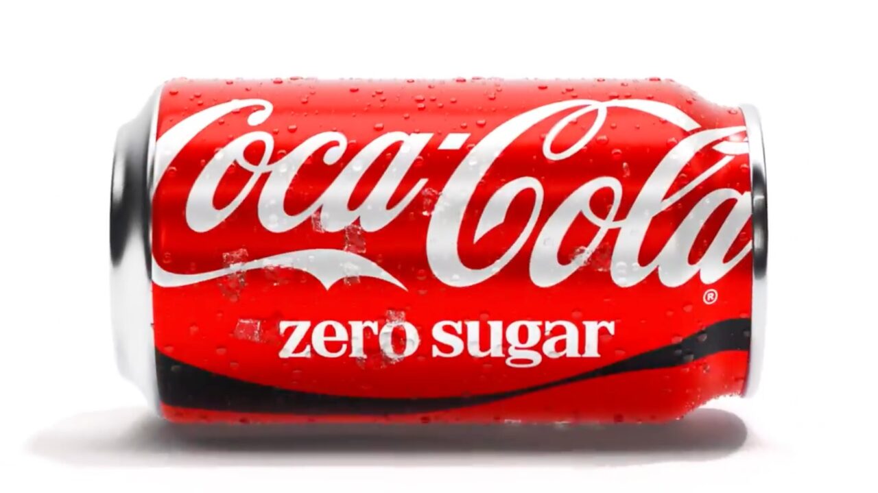
The new system also seeks to organize the product family more clearly. Coca-Cola Zero Sugar, for example, will feature a more prominent name, a black Dynamic Ribbon and a matching black cap, reinforcing its differentiation without abandoning the brand’s central architecture.
An identity designed to scale with artificial intelligence
Global consistency no longer depends solely on a brand identity manual. Coca-Cola has developed design intelligence tools such as Fizzion, created with Adobe to transform visual guidelines into adaptable assets that can be interpreted by artificial intelligence systems. The goal is to accelerate the production of localized content without allowing automation to distort the brand.
This is where the project’s true significance lies. Coca-Cola is not changing its appearance to follow a graphic trend; it is building an infrastructure capable of protecting its identity when campaigns must be multiplied across hundreds of markets, formats and versions.
The move can be described as a rebranding, although it works better as a reaffirmation. The brand does not intend to surprise consumers with something unfamiliar, but to ensure that every interaction produces an immediate reaction: this could only be Coca-Cola. At a time when many identities increasingly resemble one another, the company is investing in an advantage that cannot be manufactured overnight: being unmistakable.